- 28
- 08月
This is the twelfth article in the series in which I document my experience writing web applications in Python using the Flask microframework.
The goal of the tutorial series is to develop a decently featured microblogging application that demonstrating total lack of originality I have decided to call microblog.
Here is an index of all the articles in the series that have been published to date:
- Part I: Hello, World!
- Part II: Templates
- Part III: Web Forms
- Part IV: Database
- Part V: User Logins
- Part VI: Profile Page And Avatars
- Part VII: Unit Testing
- Part VIII: Followers, Contacts And Friends
- Part IX: Pagination
- Part X: Full Text Search
- Part XI: Email Support
- Part XII: Facelift (this article)
- Part XIII: Dates and Times
- Part XIV: I18n and L10n
- Part XV: Ajax
- Part XVI: Debugging, Testing and Profiling
Table of Contents:
[TOC]
Introduction
If you have been playing with the microblog application you must have noticed that we haven't spent too much time on its looks. Up to now the templates we put together were pretty basic, with absolutely no styling. This was useful, because we did not want the distraction of having to write good looking HTML when we were coding.
But we've been hard at work coding for a while now, so today we are taking a break and will see what we can do to make our application look a bit more appealing to our users.
This article is going to be different than previous ones because writing good looking HTML/CSS is a vast topic that falls outside of the intended scope of this series. There won't be any detailed HTML or CSS, we will just discuss basic guidelines and ideas so on how to approach the task.
How do we do this?
While we can argue that coding is hard, our pains are nothing compared to those of web designers, who have to write templates that have a nice and consistent look on a list of web browsers, most with obscure bugs or quirks. And in this modern age they not only need to make their designs look good on regular browsers but also on the resource limited browsers of tablets and smartphones.
Unfortunately, learning HTML, CSS and Javascript and on top of that being aware of the idiosyncrasies of each web browser is a task of uncertain dimensions. We really do not have time (or interest) to do that. We just want our application to look decent without having to invest a lot of energy.
So how can we approach the task of styling microblog with these constraints?
Introducing Bootstrap
Our good friends at Twitter have released an open source web framework called Bootstrap that might be our winning ticket.
Bootstrap is a collection of CSS and Javascript utilities for the most common types of web pages. If you want to see the kind of pages that can be designed with this framework here are some examples.
These are some of the things Bootstrap is good at:
- Similar looks in all major web browsers
- Handling of desktop, tablet and phone screen sizes
- Customizable layouts
- Fully styled navigation bars
- Fully styled forms
- And much, much more...
Bootstrapping microblog
Before we can add Bootstrap to our application we have to install the Bootstrap CSS, Javascript and image files in a place where our web server can find them.
In Flask applications the app/static folder is where regular files go. The web server knows to go look for files in these location when a URL has a /static prefix.
For example, if we store a file named image.png in /app/static then in an HTML template we can display the image with the following tag:
<img src="/static/image.png" />
We will install the Bootstrap framework according to the following structure:
/app
    /static
        /css
            bootstrap.min.css
            bootstrap-responsive.min.css
        /img
            glyphicons-halflings.png
            glyphicons-halflings-white.png
        /js
            bootstrap.min.js
Then in the head section of our base template we load the framework according to the instructions:
<!DOCTYPE html>
<html lang="en">
  <head>
    ...
    <link href="/static/css/bootstrap.min.css" rel="stylesheet" media="screen">
    <link href="/static/css/bootstrap-responsive.css" rel="stylesheet">
    <script src="http://code.jquery.com/jquery-latest.js"></script>
    <script src="/static/js/bootstrap.min.js"></script>
    <meta name="viewport" content="width=device-width, initial-scale=1.0">
    ...
  </head>
  ...
</html>
The link and script tags load the CSS and Javascript files that come with Bootstrap. Note that one of the required Javascript files is jQuery, which is used by some of the Bootstrap plugins.
The meta tag enables Bootstrap's responsive mode, which scales the page appropriately for desktops, tablets and smartphones.
With these changes incorporated into our base.html template we are ready to start implementing Bootstrap, which simply involves changing the HTML in our templates.
The changes that we will make are:
- Enclose the entire page contents in a single column fixed layout with responsive features.
- Adapt all forms to use Bootstrap form styles.
- Replace our navigation bar with a Navbar.
- Convert the previous and next pagination links to Pager buttons.
- Use the Boostrap alert styles for flashed messages.
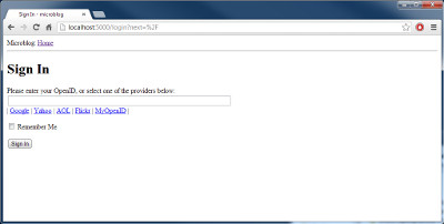
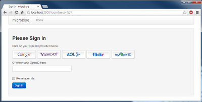
- Use styled images to represent the suggested OpenID providers in the login form.
We will not discuss the specific changes to achieve the above since these are pretty simple. For those interested, the actual changes can be viewed in diff form on this github commit. The Bootstrap reference documentation will be useful when trying to analyze the new microblog templates.
Final words
Today we've made the promise to not write a single line of code, and we stuck to it. All the improvements we've made were done with edits to the template files.
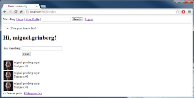
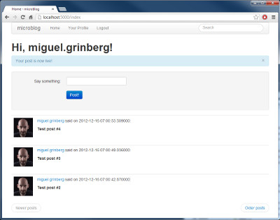
To give you an idea of the magnitude of the transformation, here are a few before and after screenshots. Click on the images to enlarge.
The updated application can be downloaded below:
Download microblog-0.12.zip.
In the next chapter we will look at improving the formatting of dates and times in our application. I look forward to see you then!
Miguel
Origin: http://blog.miguelgrinberg.com/post/the-flask-mega-tutorial-part-xii-facelift